Leanne Kilroy knows a good thing when she sees it. She fell hard for her future spouse, Eric Fulwiler, as a high school freshman in Newton, Massachusetts. “It is nuts to me that my husband was the 14-year-old with braces and a buzzcut that would pass me notes in math class!” she shares. “It especially weirds me out because we broke up for 13 years and I loved him so much the whole time—it seemed impossible that we would ever be together again.” Yet here they are today, happily married, living in a Victorian townhouse in London with three girls, an au pair, and a cat (and most recently, two Ukrainian refugees).
Clearly, Leanne has vision. As the founder of Good Bones, an online shop specializing in vintage and antique Scandinavian and mid-century pieces, she has an eye for spotting hidden treasures (a talent she shares with her dad, who owned ” the legendary but now-closed antiques shop on Beacon Hill in Boston, called Danish Country”). And as a designer, she loves nothing more than to remodel a space with potential (good bones, if you will).
Just take a look at her kitchen. When the couple purchased the home, “it was a boarding house, with a second kitchen upstairs and lots of chopped-up spaces, and it wasn’t in the best condition. The main kitchen was, quite literally, disgusting,” she tells us. Undaunted, Leanne sketched out plans for an extension involving Shaker cabinets and lots of skylights and windows (“the best way to describe what we were going for is a “Victorian orangerie”)—and trusted in her vision.
Here’s how it all came together.
Photography by Leanne Kilroy.
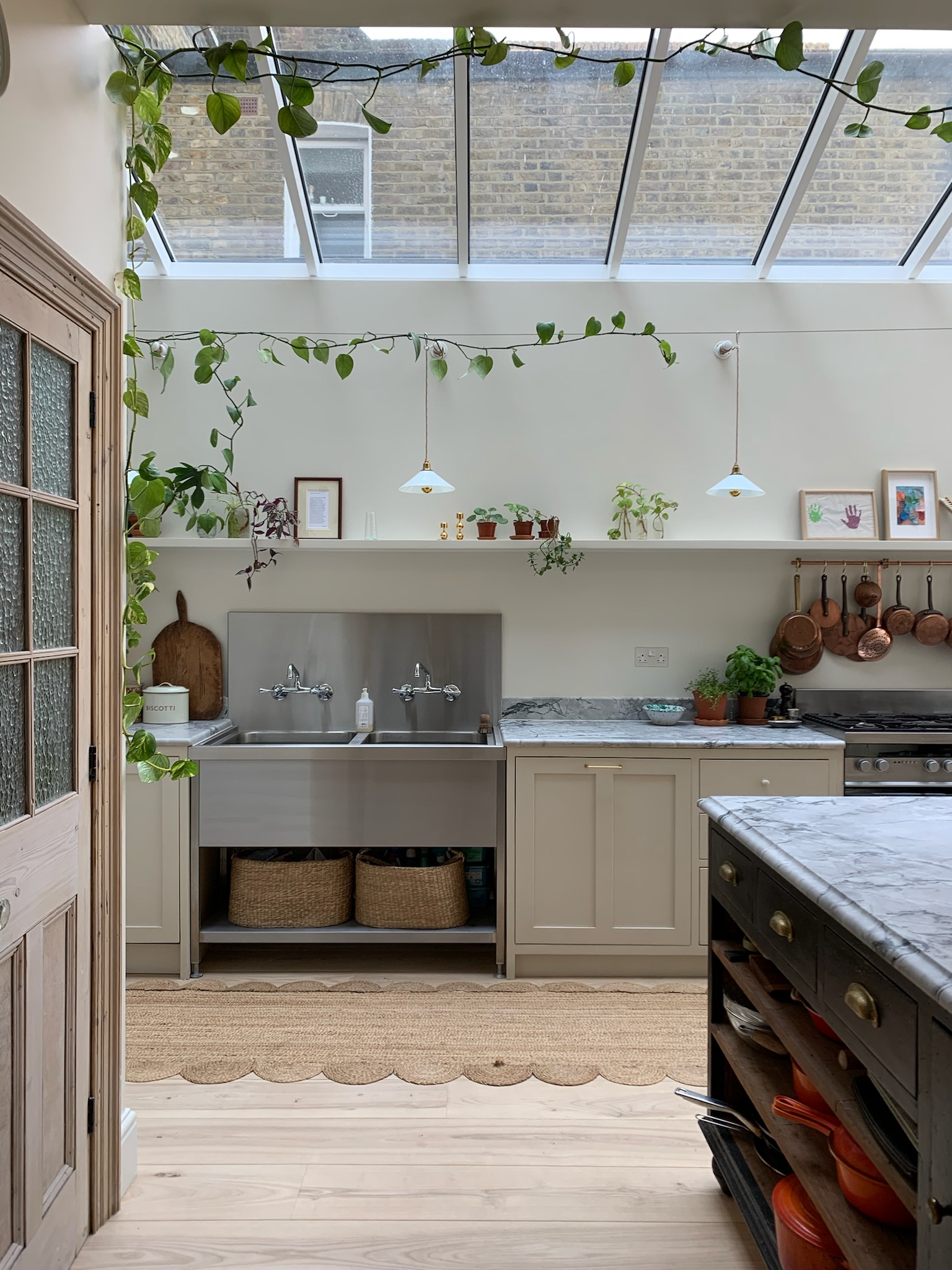 Above: “The starting point was the glass roof. We knew we wanted the kitchen to sit under a fully glazed roof, and we also wanted to avoid anything modern that might clash with the Victorian bones of the house,” says Leanne. Also on her must-have list: Shaker cabinets. She received outrageous estimates for custom ones (one place quoted nearly £20,000 for essentially six cabinets). Her solution: hiring furniture restoration firm Monkey and Bird to make the cabinets affordably.
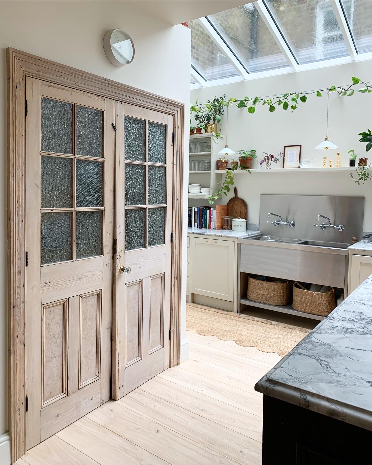 Above: “The kitchen is a big mix of new and old,” says Leanne. She found the pantry doors on eBay and whitewashed them with a mixture of white undercoat and water. The milk glass pendant lights are also vintage, from Agapanthus Interiors. The sink was custom-made by a commercial catering equipment company called KS Kitchen Solutions. “The faucets are cheapos from the US; I bought them online from Kingston Brass for under $100 each and carried them back in my suitcase last summer.”
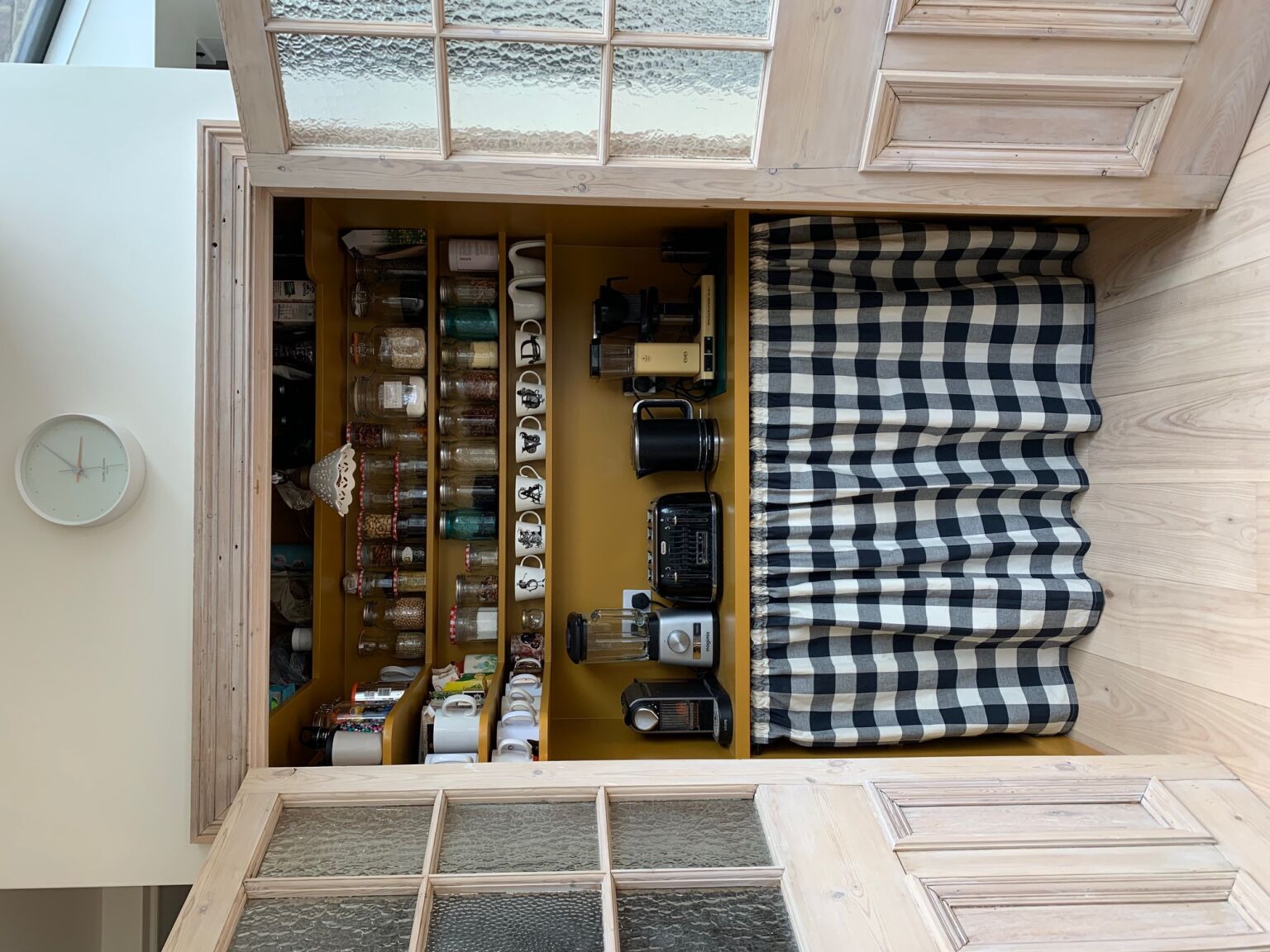 Above: “We built the pantry to fit the vintage doors, then reused an old architrave from elsewhere in the house to make them look like they’d always been there,” says Leanne. Inside the pantry, a breakfast station of small appliances awaits, including a blender, coffee maker, and toaster. Behind the sink skirt is a microwave. The inside is painted Muga by Paint & Paper Library.
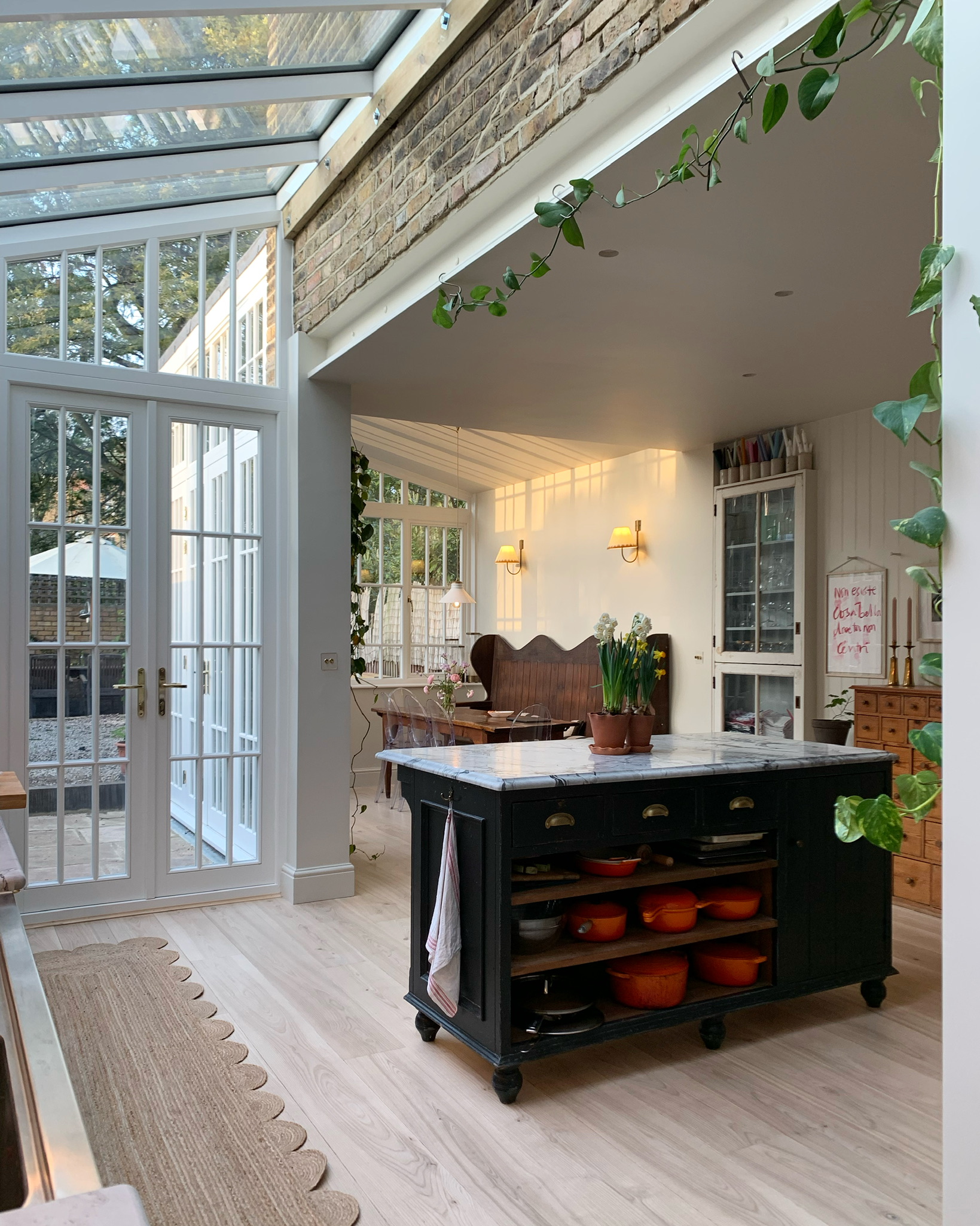 Above: The floor is engineered French ash, with underfloor heating, finished with an invisible oil. The counters and island are topped with bianco eclipsia quartzite in a leathered finish.
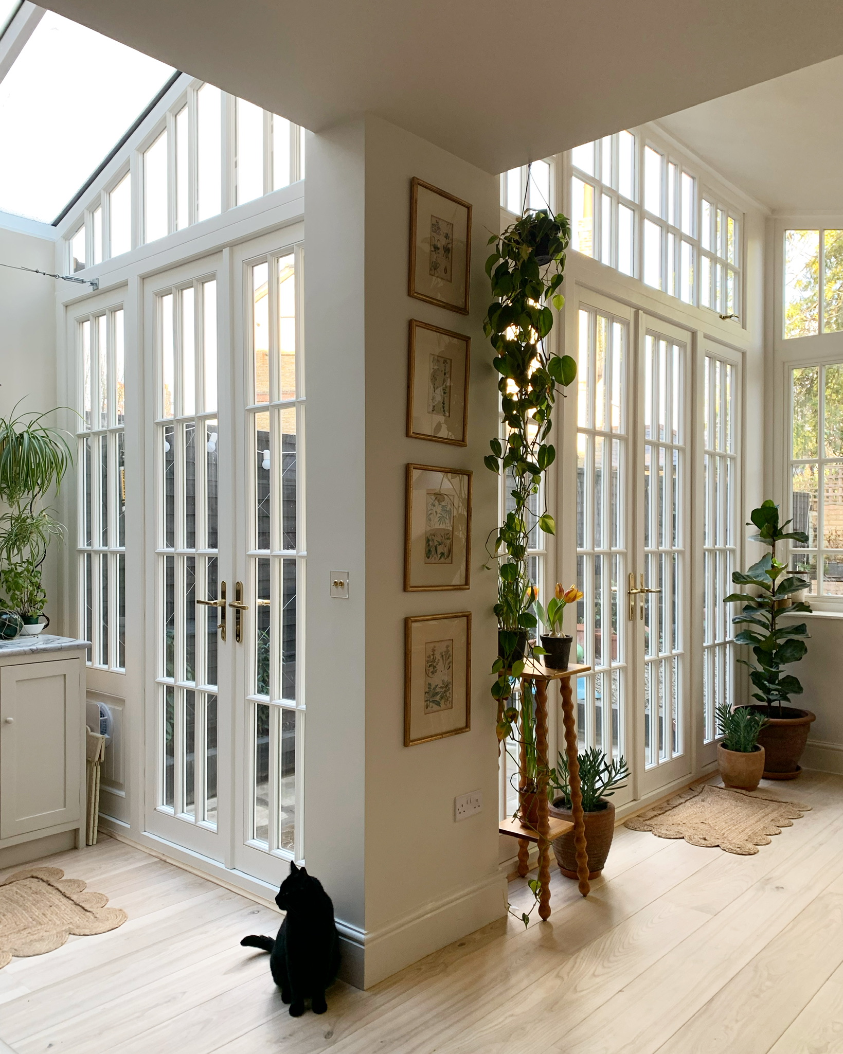 Above: “If I had to pick my favorite part of this kitchen, it’s probably, predictably, the glass. I love the glass roof so much, it transforms dark London days indoors,” says Leanne.
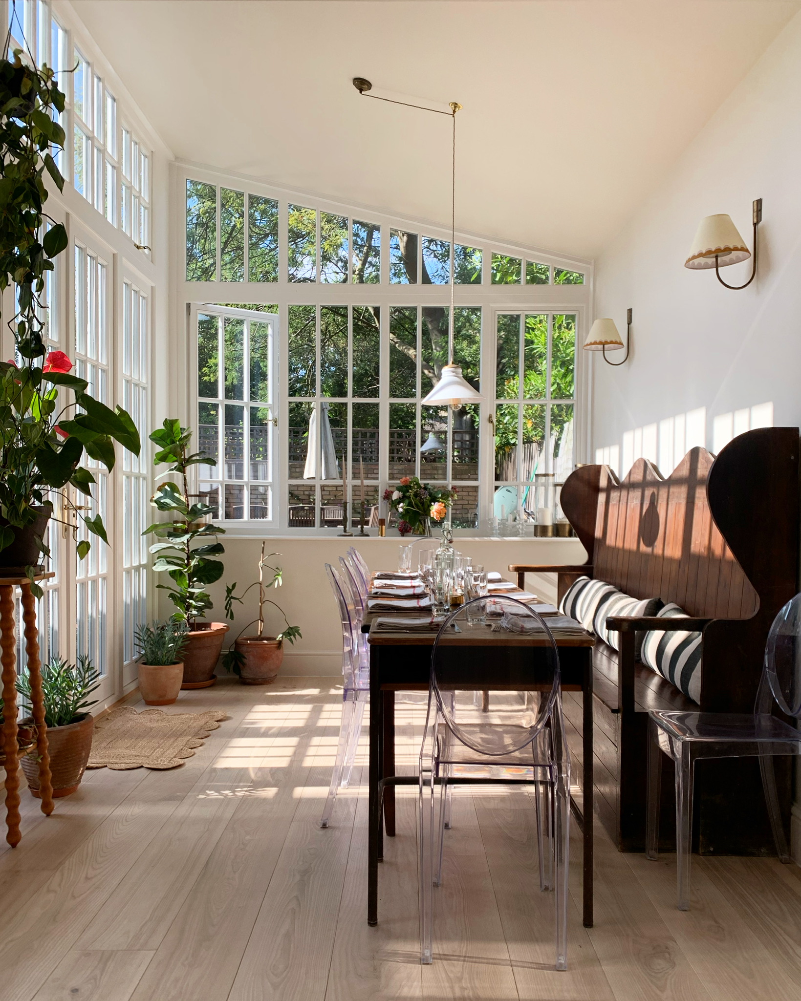 Above: “I found our epic kitchen bench, technically called a ‘settle’ here in England, on Instagram from a seller called Stowaway London. I fell for it so hard, we ended up reworking the dining nook plans to fit it in.” The two wall lights are from Jim Lawrence, with shades Leanne bought on Amazon and painted herself.
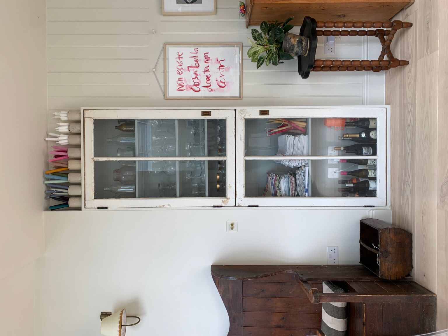 Above: “The glass doors of the wall cupboard were also an eBay find, and we made the wall cupboard to fit them. I’ve left them in exactly the condition they were when they arrived —covered in old, chipping paint—partly because I was worried that the big panes of glass may break if I tried to mess with them, but also because I like how they look like they’ve always belonged there.”
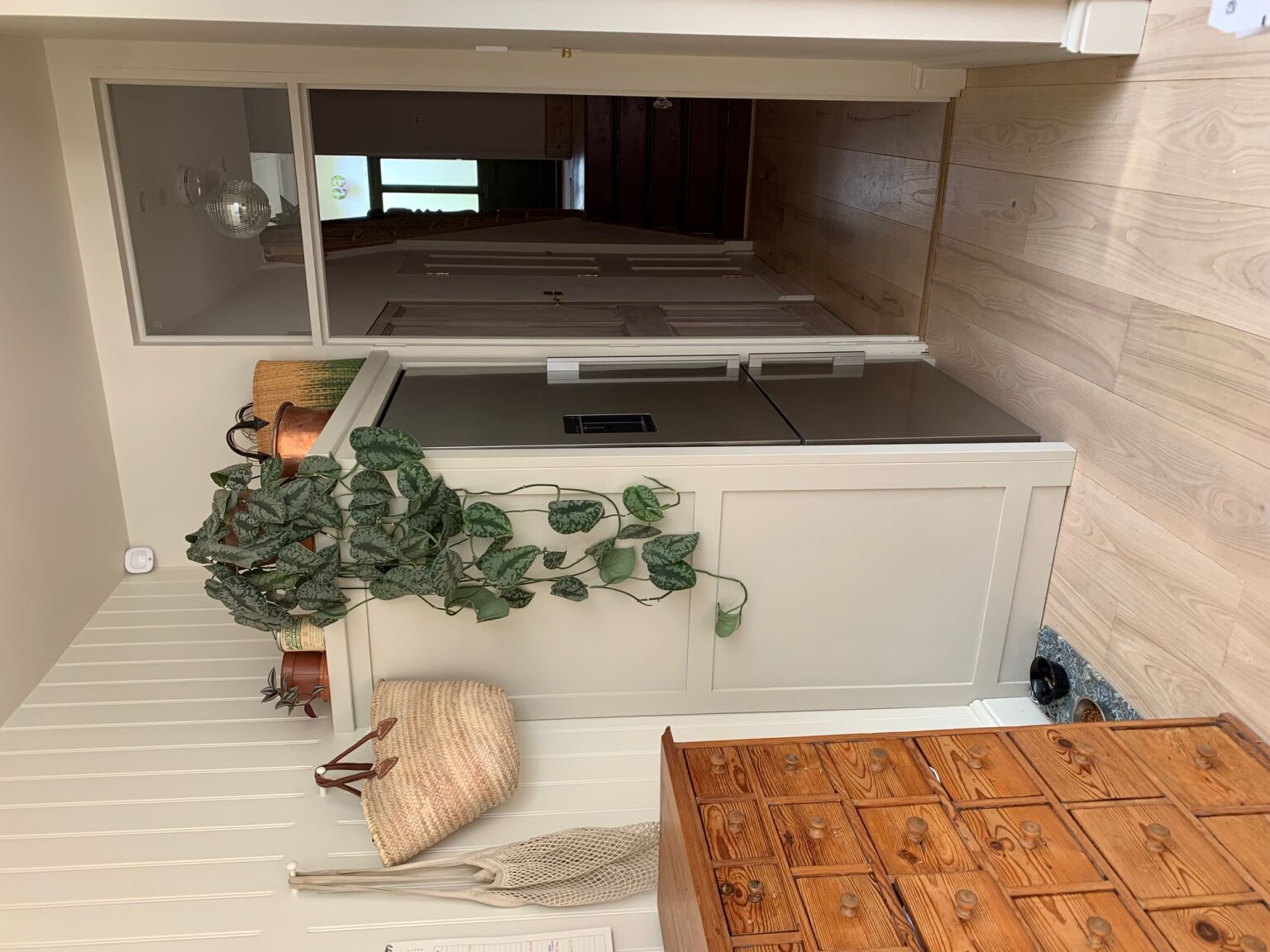 Above: “The fridge/freezer lives in the corner next to the apothecary and is surrounded by a paneled wooden box made by Monkey and Bird so it blends right in without the expense of being fully integrated.”
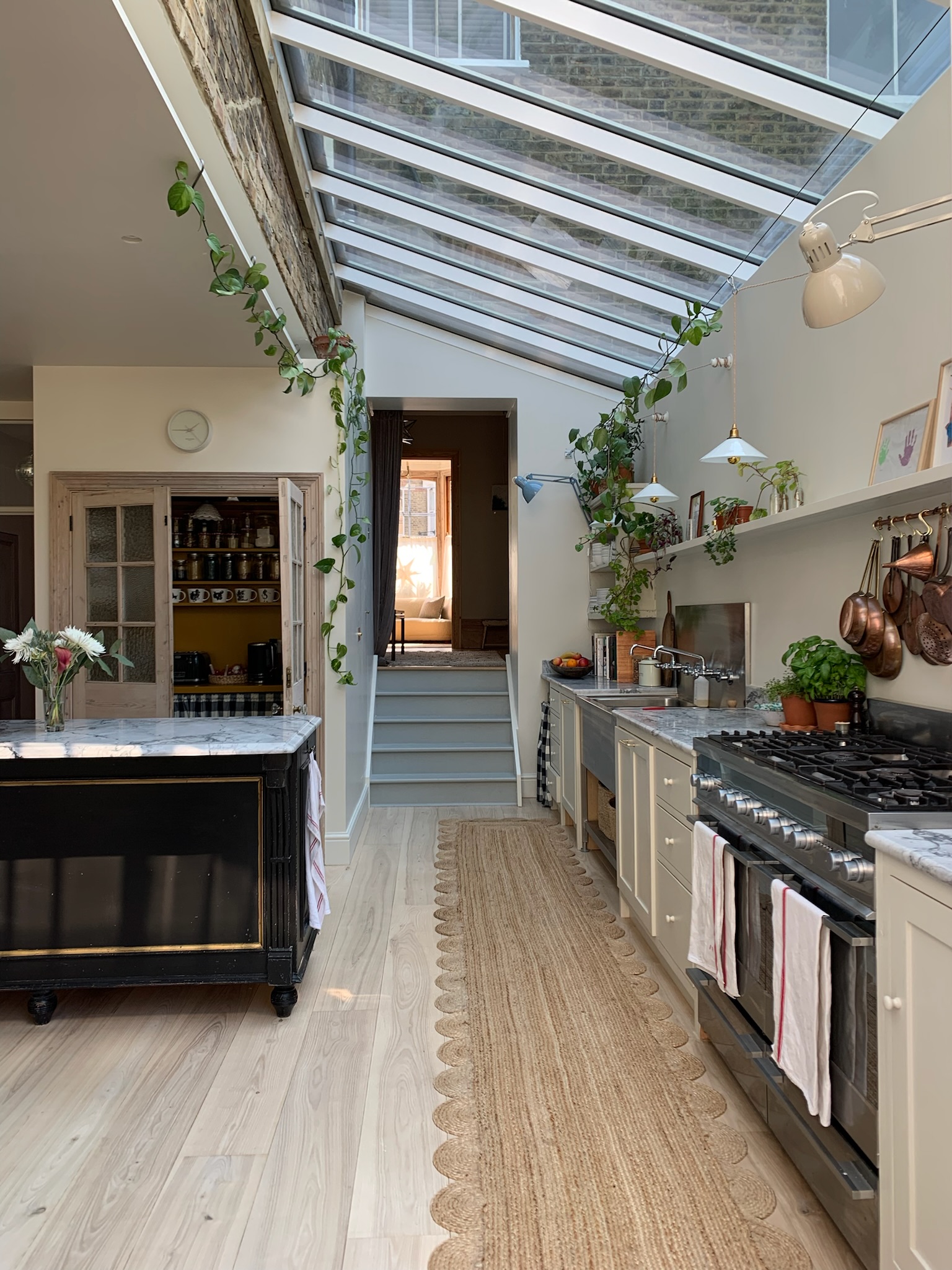 Above: “The stove is the only thing we saved from the house’s main kitchen when we moved in. It’s a 20-year-old Fisher & Paykel 1200mm range on its last legs,” says Leanne. In addition to the pendant lights, two clip-on task lights—the Tertial from IKEA—and a diffused LED strip integrated into the entire length of the floating shelf provide ample task lighting.
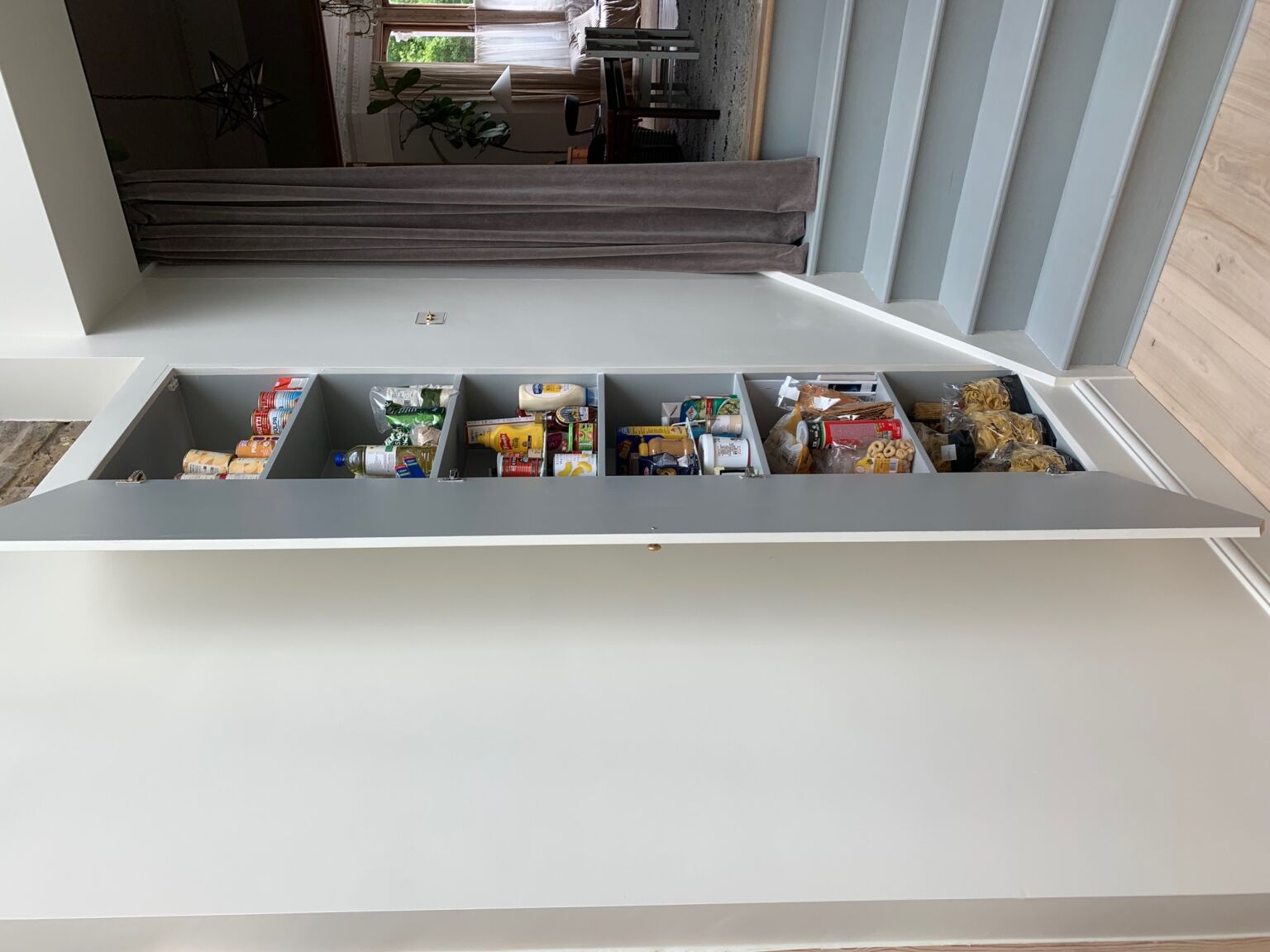 Above: A nearly invisible pantry, cut into the wall with shallow shelving, is the perfect spot for canned goods and more pantry items. The interior is painted the same color as the steps (Double Smoked Green Blue by Atelier Ellis.
For more Kitchens of the Week, see:

